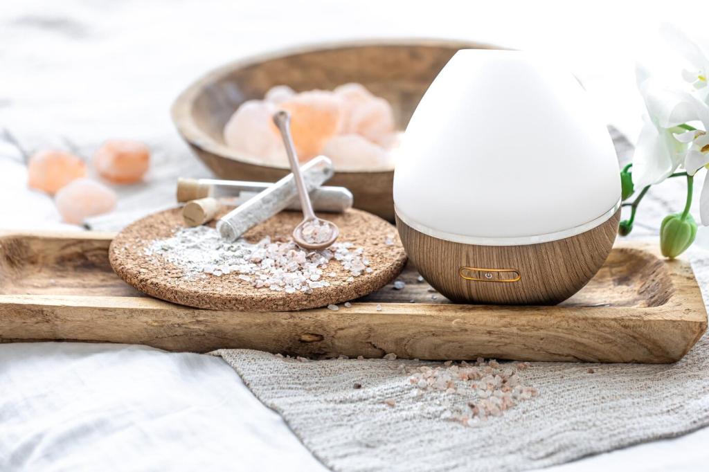

Sustainable Palettes: Nature as Color Mentor
Clay-washed beiges, chalky olives, and limestone whites offer depth without chemical harshness. Low-VOC paints protect indoor air—and your weekend headaches. Share your favorite clean brand and how the room smelled a day later.
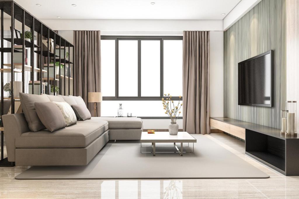
Sustainable Palettes: Nature as Color Mentor
Moss, fern, and riverstone hues blur boundaries between inside and outside. With plants and linen textures, rooms breathe easier. Post a photo of your calmest corner and the single green that made it feel bigger.
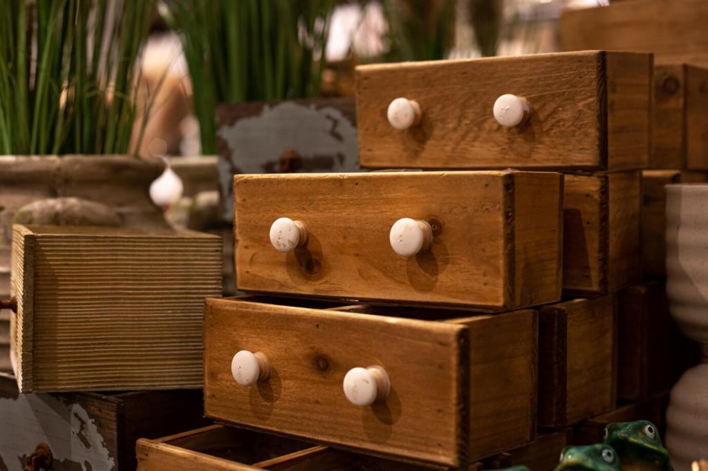
Sustainable Palettes: Nature as Color Mentor
Rescue furniture with color stories instead of landfill. A navy frame, clay drawer fronts, and cane panels can modernize a tired dresser. Tell us your most successful makeover palette and why it earns compliments.